
Monday, July 29, 2013 From rOpenSci (https://ropensci.org/blog/2013/07/29/rwbclimate-rgbif/). Except where otherwise noted, content on this site is licensed under the CC-BY license.
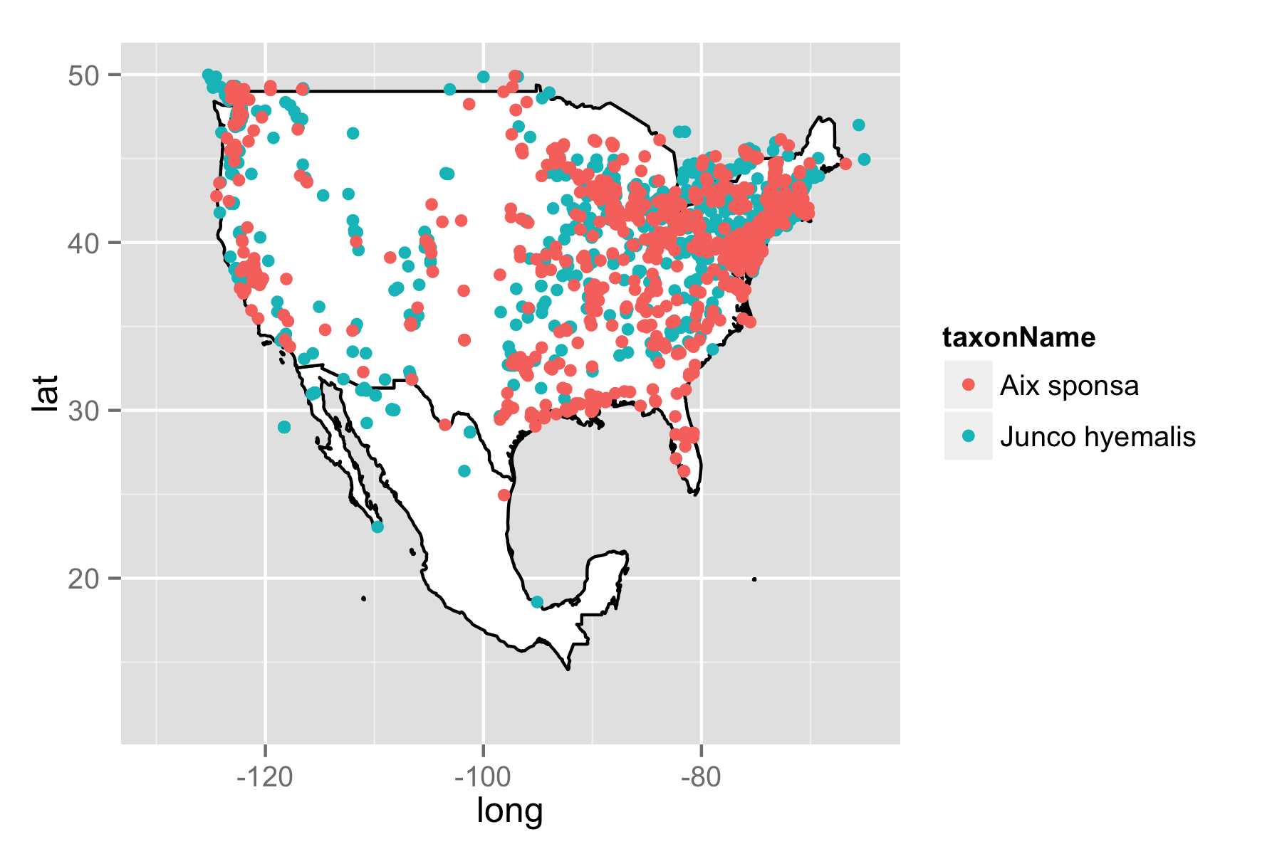
One of our primary goals at ROpenSci is to wrap as many science API’s as possible. While each package can be used as a standalone interface, there’s lots of ways our packages can overlap and complement each other. Sure He-Man usually rode Battle Cat, but there’s no reason he couldn’t ride a my little pony sometimes too. That’s the case with our packages for GBIF and the worldbank climate data api. Both packages will give you lots and lots of data, but a shared feature of both is the ability to plot spatial information. The rWBclimate package provides a robust mapping ability on top of access to climate data. At it’s most bare bones, it can be used as alternative to the built in mapping facilities included in rgbif. Building on the example in the rgbif tutorial we’ll plot data for two species in the US and Mexico, the dark eyed junco (Junco hyemalis) and the wood duck (Aix sponsa). Here’s how you can use the kml interface from rWBclimate to download a map of the US and Mexico and overlay it with data from rgbif.
library(ggplot2)
library(rWBclimate)
library(rgbif)
## Grab some occurrence data

splist <- c("Junco hyemalis", "Aix sponsa")
out <- occurrencelist_many(splist, coordinatestatus = TRUE, maxresults = 1000)

## Set the map data path
options(kmlpath = "/Users/edmundhart/kmltemp")
sp.map.df <- create_map_df(c("USA","MEX"))

## create map plot
sp.map <- ggplot(sp.map.df,aes(x=long,y=lat,group=group))+geom_polygon(fill="white",colour="black")+xlim(-130,-65)+ylim(12,50)

## Overlay occurrence data
sp.map + geom_point(data=gbifdata(out),aes(y=decimalLatitude,x=decimalLongitude,group=taxonName,colour=taxonName))
🔗 Overlaying climate data with occurrence data
So that’s how you could make a basic map, but what if you want to overlay climate data with occurrence data? That’s easy too. You repeat essentially the same steps as above, but be sure to grab some climate data too. In this example I’ve chose to grab data for 8 different tree species that exhibit somewhat of a lattitudinal gradient. I’ll map them on top of historical temperature data. In this case I’ll be using the average annual temperature from 1990 to 2000. Because I want a bit better spatial resolution I’ll be using basin level data instead of country level data.
### Download map data
usmex <- c(273:284,328:365)
usmex.basin <- create_map_df(usmex)

## Download temperature data
temp.dat <- get_historical_temp(usmex, "decade" )
temp.dat <- subset(temp.dat,temp.dat$year == 2000 )


#create my climate map
usmex.map.df <- climate_map(usmex.basin,temp.dat,return_map=F)


## Grab some species occurrence data for the 8 tree species.

splist <- c("Acer saccharum",
            "Abies balsamea",
            "Arbutus texana",
            "Betula alleghaniensis",
            "Chilopsis linearis",
            "Conocarpus erectus",
            "Populus tremuloides",
            "Larix laricina")
out <- occurrencelist_many(splist, coordinatestatus=TRUE, maxresults=1000, fixnames="match")

## Now just create the base temperature map
usmex.map <- ggplot()+geom_polygon(data=usmex.map.df,aes(x=long,y=lat,group=group,fill=data,alpha=.8))+scale_fill_continuous("Average annual \n temp: 1990-2000",low="yellow",high="red")+ guides(alpha=F)+theme_bw()


## And overlay of gbif data
usmex.map + geom_point(data=gbifdata(out),aes(y=decimalLatitude,x=decimalLongitude,group=taxonName,colour= taxonName)) + xlim(-125,-59)+ylim(5,55)
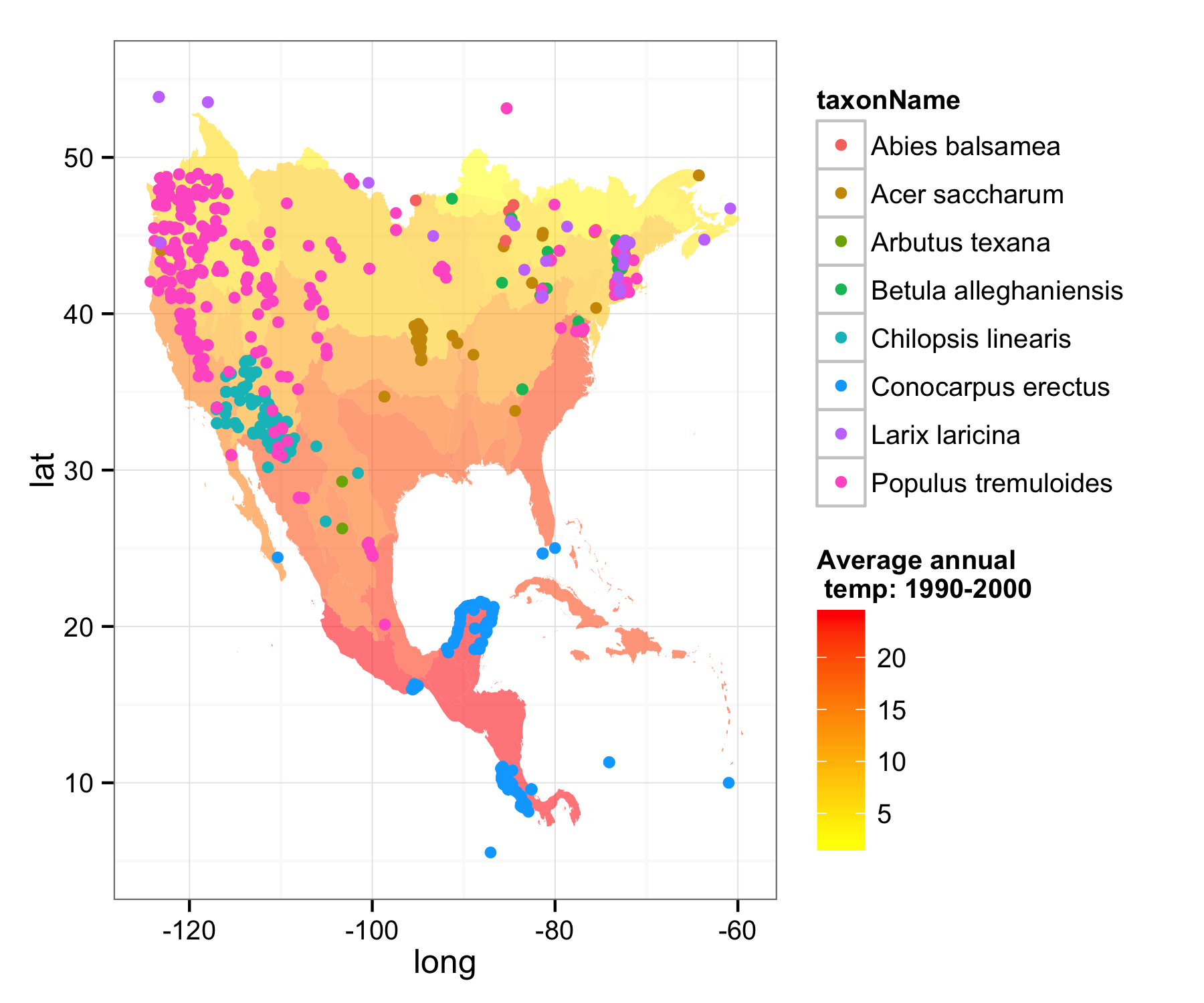
The map doesn’t have borders because it’s created at the basin level, but it would be easy enough to add an outline for the countries. You could also plot any of your own data over climate maps because they are based on decimal lattitude and longitude coordinates, or data from multiple sources.
Filed under
Suggest an edit
Open a pull request
